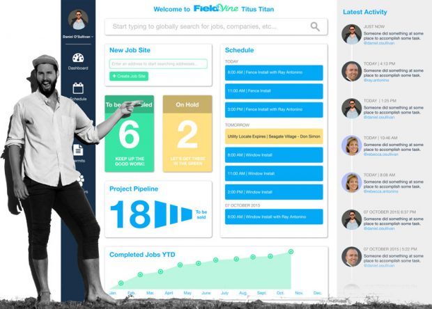
Dashboards are useful for contextualizing data and providing a platform for making assessments at a glance. Because of that, having a dashboard is always better than not having a dashboard in a business environment.
There are thousands of software platforms with built-in and preconfigured dashboards to help business owners make better analyses and decisions – but many find that these eventually become inadequate or inefficient.
The solution is to create your own dashboard, rather than relying on one that was designed and created on your behalf. But what steps can you take to create a better dashboard?
Use the Right Tools
You can start by using the right tools for the job. If you have some programming experience, you might be able to create your own dashboard entirely from scratch. For the rest of us, it’s much easier to use an existing dashboard creation tool, giving you the power to create your own dashboards from scratch without any technical knowledge or background.
That said, if you’re using a dashboard creation tool, you should know that some tools are superior to others. With some tools, you’ll have a broader range of features to work with, a more intuitive platform, and a finished result that looks more professional.
Make sure you shop around before committing to any single creation tool.
Understand Your Most Important Metrics
A dashboard is only going to be as effective as the information it presents; that’s why deciding which metrics are going to be featured is one of your most important initial choices. Take a moment to determine what your most important metrics are. What are the numbers in this dashboard that are going to have the biggest impact on your topic of study? Are you looking for a number of closed sales? The number of organic visitors you get to your website?
Once you have your most important metrics in mind, find a place for them that’s as visible and prominent as possible. This way, anyone utilizing the dashboard will be able to see, immediately, how things are going.
Keep It Focused
In line with this, it’s important to keep your dashboard as focused as possible on your main subject. Some analysts and decision makers are tempted to stuff as many pieces of information as possible into the dashboard, overloading it with information and ultimately making it more complicated. There’s nothing wrong with having more information, and in many cases, having a more versatile panel can be an advantage. But for most people and situations, it’s better to have a more concise and focused dashboard on hand.
Allow Plenty of White Space
In the world of art, white space (or negative space) is important because it frames the subject and lends itself to better composition. Ample white space, when used properly, can direct a person’s eyes to the most important features of a piece of art and enhance the most beautiful qualities of the piece.
In a dashboard, you can use whitespace in a similar way. The more open and uncluttered space that you have on your dashboard, the more prominent your information and data points are going to look.
Experiment
Most dashboard creation tools have built-in features to make it easy to experiment with new approaches; you can try different design elements, different layouts, and different selections of metrics to see what works best for your needs. If you have access to these flexible features, take advantage of them and try out a variety of different layouts and approaches so you can learn which ones are best.
Use the Right Visuals
Different visuals offer different strengths and weaknesses. For example, line graphs are much better for showing trends over time than circle graphs. But circle graphs are much better at comparing different sets of information against each other. Try to use a mix of different visuals to depict the different variables and metrics in your dashboard. This way, you’ll be able to capitalize on the advantages of all of them.
Prioritize Reporting
Dashboards are excellent tools for data communication. Accordingly, you should optimize the dashboard layout so that the metrics presented within are easier to demonstrate and communicate when reporting.
Test It
Finally, consider testing your dashboard in a live environment. If there are multiple people who are going to use this dashboard, have those people try things out and give you their honest feedback. You’ll be able to learn whether you’re missing any important pieces of information, if your layout is as clean and intuitive as you think, and you’ll be able to collect even more suggestions to improve your dashboard further.
Creating the perfect dashboard isn’t easy. But if you follow these important tips and strategies, you’ll be in a much better position to develop the solution your company needs.


